library(dplyr)
library(tidyr)
library(purrr)
library(readr)
library(ggplot2)
library(patchwork)
library(ggdag)
library(dagitty)

set.seed(20260730)

# Four significant figures, so C6HJR's published Multi100 statistic prints as -3.804 rather than
# being rounded down to three by the default settings of the tibble printer.
options(width = 88, pillar.sigfig = 4)

euframes <- read_csv("../data/EUframes_cy.csv", show_col_types = FALSE)

# Nodes are drawn as rounded boxes rather than circles: a circle wide enough to
# hold "unemployment" without clipping would swamp a four-node graph.
node_box <- function() {
  geom_label(aes(label = name), fill = "#00205b", colour = "white",
             size = 3.2, fontface = "bold", linewidth = 0,
             label.r = grid::unit(5, "pt"),
             label.padding = grid::unit(5, "pt"))
}Causal graphs
Confounders, mediators and colliders, and the adjustment set for the case
This is the causal-graphs module of the companion curriculum, and it is optional. On the workshop day the topic gets about thirty minutes: Part 2 introduces the estimand and sketches a directed acyclic graph for the claim under test, and Task 2 asks you to finish that graph and read a control set off it. That is long enough to learn what a graph is for, but too short to practise drawing and querying one. This module builds every graph from scratch, fits the models that the graphs imply on the course data, and shows two ways in which a graph can go wrong that no model output would reveal.
It follows on from getting started with R and assumes what that module covers – reading a CSV, a short dplyr chain, a model formula, and the aes()-and-geoms grammar of a ggplot. Everything else is introduced here. Every chunk runs when the page is built, so the numbers below are what the code returns, and you can reproduce all of them from the shipped EUframes_cy.csv.
1. Arrows as claims
A directed acyclic graph, or DAG, is a picture of what you believe causes what. Directed means every edge is an arrow with a head and a tail, and the head is the effect. Acyclic means you cannot follow arrows out of a variable and come back to it, which is a substantive restriction: it says that the graph describes causation at a level of time resolution where nothing causes itself.
A DAG describes the world that you are prepared to assume, and the regression follows from it once those assumptions are stated as arrows, so drawing one is not a way of illustrating a model that you have already chosen. That order of work – from a stated target quantity to the assumptions, and only then to a specification – is the discipline drilled in Part 2 of the workshop, and it is stated at length in the estimand literature that this course draws on (Lundberg et al. 2021; Hernán and Robins 2020).
In R the graph is built with dagify() from the ggdag package, and each edge is written as an ordinary formula. The outcome goes on the left of the tilde and its causes on the right, as in lm(), so framing ~ unemployment reads ‘unemployment causes framing’.
first <- dagify(
  framing      ~ unemployment,   # the effect we want to estimate
  framing      ~ country,        # stable national traits shape framing
  unemployment ~ country,        # and shape the labour market too
  exposure = "unemployment",
  outcome  = "framing",
  coords = list(x = c(unemployment = 0, framing = 2, country = 1),
                y = c(unemployment = 0, framing = 0, country = 1))
)

adjustmentSets(first)
{ country }There is an older way of writing the same graph, as a quoted string in the mini-language of dagitty itself, and this module does not use it, for two reasons. The first is that a formula is an R expression, so a # in front of one comments the arrow out and the call still parses, which makes ‘uncomment the arrow you believe’ a one-character edit. The second is that adding an arrow becomes a code change like any other. Nothing is lost by writing the edges as formulas, because dagify() returns a dagitty object and the query functions used throughout this page all come from the dagitty package.
The picture itself is an ordinary ggplot. tidy_dagitty() turns the object into a data frame of nodes and edge endpoints, and from there the layers are geoms and themes of the kind that the ggplot2 section of the R module builds up. geom_dag_edges() draws the arrows and theme_dag() strips away the axes that a graph has no use for. The nodes come from node_box(), the small helper defined in the setup chunk, which is a labelled rectangle roomy enough for a word like unemployment; the stock pairing of geom_dag_point() and geom_dag_text() gives the circled nodes that section 2 uses instead. This is the point at which that module stops being optional background, because everything below assumes you can read a layered plot.
first |>
  tidy_dagitty() |>
  ggplot(aes(x = x, y = y, xend = xend, yend = yend)) +
  geom_dag_edges(edge_colour = "#6c757d",
                 arrow_directed = grid::arrow(length = grid::unit(7, "pt"),
                                              type = "closed")) +
  node_box() +
  theme_dag() +
  expand_limits(x = c(-0.35, 2.35), y = c(-0.25, 1.25))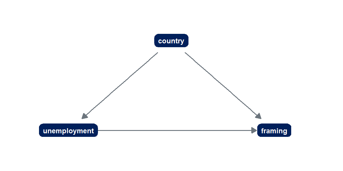
2. Confounder, mediator, collider
Most adjustment decisions come down to recognising one of three arrangements of three variables. The useful mental picture, taken from the ggdag documentation, is that association flows along a path the way that water flows down a pipe, and each shape either lets it through or blocks it.
shapes <- list(
  "confounder z" = dagify(y ~ x + z, x ~ z,
    coords = list(x = c(x = 0, y = 2, z = 1), y = c(x = 0, y = 0, z = 1))),
  "mediator m"   = dagify(m ~ x, y ~ m,
    coords = list(x = c(x = 0, y = 2, m = 1), y = c(x = 0, y = 0, m = 1))),
  "collider c"   = dagify(c ~ x + y,
    coords = list(x = c(x = 0, y = 2, c = 1), y = c(x = 0, y = 0, c = -1)))
)

draw_shape <- function(d, title) {
  d |>
    tidy_dagitty() |>
    ggplot(aes(x = x, y = y, xend = xend, yend = yend)) +
    geom_dag_edges(arrow_directed = grid::arrow(length = grid::unit(7, "pt"),
                                                type = "closed")) +
    geom_dag_point(size = 14, colour = "#00205b") +
    geom_dag_text(colour = "white", size = 4.2) +
    theme_dag() +
    labs(title = title) +
    scale_x_continuous(expand = expansion(mult = 0.2)) +
    scale_y_continuous(expand = expansion(mult = 0.3))
}

imap(shapes, draw_shape) |> wrap_plots(nrow = 1)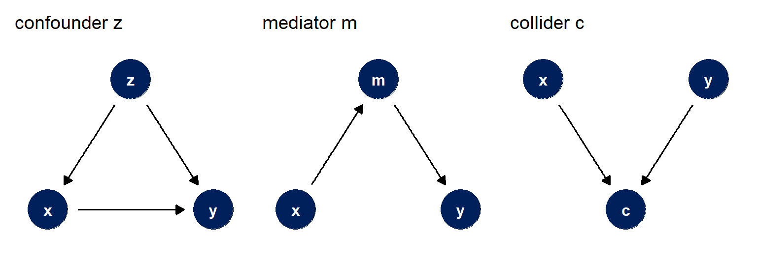
A confounder is a common cause of both the exposure and the outcome. It opens a path between them that has nothing to do with the effect you want, so the plain association mixes the effect with the confounding. Adjusting for a confounder blocks that path, and it is the adjustment that most analysts already know how to make.
A mediator lies on the path from exposure to outcome and transmits part of the effect. Whether to adjust for one depends entirely on which quantity you are after. If you want the total effect of the exposure, leave the mediator out, because adjusting for it removes the portion of the effect that travels through it. If you want the direct effect, the part that does not travel through the mediator, then you adjust. Whether an adjustment is correct therefore depends on the estimand that you have named.
A collider is a common effect of two variables, and it is the shape that most people have never been taught. A collider blocks the path between its two causes when you leave it alone, which is why the plain association between them is undisturbed. Conditioning on it opens the path. The reason is simple arithmetic. Suppose that the level of EU politicisation in a country-year is roughly the sum of its unemployment and its framing. Knowing only that unemployment is high tells you nothing about framing. But once you also fix politicisation at some value, the two become linked by subtraction, because whatever unemployment does not supply, framing must. Conditioning on a common effect creates a relationship between causes that were unrelated to begin with.
Three practical rules follow. Adjust for confounders, leave mediators alone when the target is the total effect, and do not adjust for a collider unless you know what you are doing and can say what the resulting estimate means.
3. Conditioning on a collider
A rule you have only read is easy to forget, so the fastest way to learn the third one is to build data whose answer you already know and then break the rule. The recipe below writes a real effect into the data – a one-unit rise in unemployment moves framing by exactly 0.5 – and then creates a variable caused by both. In the terms of the course case, that third variable is politicisation. A slump raises unemployment, sour public framing pushes in the same direction, and parties and media respond to both by making the EU a live political issue.
# Seeded here rather than only at the top, so the chunk stands alone if you
# copy it out and so an edit upstream cannot shift these numbers.
set.seed(20260730)

made_up <- tibble(
  unemployment   = rnorm(2000),
  framing        = 0.5 * unemployment + rnorm(2000),
  politicisation = 0.8 * unemployment + 0.8 * framing + rnorm(2000)
)

list(
  "unemployment alone"            = framing ~ unemployment,
  "unemployment + politicisation" = framing ~ unemployment + politicisation
) |>
  imap(\(f, nm) {
    p <- parameters::model_parameters(lm(f, data = made_up))
    tibble(model = nm, planted = 0.5,
           estimate = p$Coefficient[p$Parameter == "unemployment"],
           se       = p$SE[p$Parameter == "unemployment"])
  }) |>
  list_rbind() |>
  mutate(across(where(is.numeric), \(x) signif(x, 3)))
# A tibble: 2 × 4
model planted estimate se
<chr> <dbl> <dbl> <dbl>
1 unemployment alone 0.5 0.463 0.0228
2 unemployment + politicisation 0.5 -0.133 0.0233The first row is close to the 0.5 that the recipe wrote in, within a couple of its own standard errors. The second, which looks like the more careful analysis because it holds a third variable constant, returns an estimate of the wrong sign, a long way from 0.5 and many standard errors from it. No diagnostic on those two models would tell you which one to believe. They fit the same data, and the model with the wrong estimate fits it far better on every routine criterion – its R2 is three times that of the first model, and both AIC and BIC prefer it by a thousand points.
Stated generally, selecting on a variable is conditioning on it. Restricting a sample to the people who stayed in a study, to the country-years that meet some threshold, or to the respondents who answered a follow-up question does everything to the estimate that putting the variable on the right-hand side would do, and it does it silently, because nothing appears in the model output at all. That is the mechanism behind a well-documented pattern in the COVID-19 literature, where associations estimated among tested or hospitalised people turned out to be artefacts of who got tested (Griffith et al. 2020), and it is set out in general form by Cole et al. (2010).
TipTry it
Change the recipe so that politicisation is caused only by unemployment and not by framing, making it a descendant of the exposure rather than a collider. Refit both models. Then make it a cause of both instead, so it is a confounder, and refit again. Across the three graphs, each generating its own dataset, the same second model is wrong, harmless and required in turn.
4. The graph for the case
The claim at the centre of the course comes from a 2016 study of how Europeans frame the European Union, whose author this site refers to as the original author, or OA (Teney 2016). OA’s argument is that economic hardship shifts the terms in which people talk about the EU away from cosmopolitan ones, and the reanalysis you work on tests one version of it: whether the unemployment rate in a country-year is associated with the mean cosmopolitan framing of its respondents.
Here is that claim as a graph. The node names describe concepts. unemployment is the idea and unemp is the measurement of it in the EU-frames dataset, and keeping the two names apart stops the graph from becoming a picture of the regression.
case <- dagify(
  framing      ~ unemployment,   # the effect of interest
  framing      ~ country,        # national traits: size, EU tenure, history
  framing      ~ year,           # EU-wide shocks common to a given year
  unemployment ~ country,        # those same traits shape the labour market
  unemployment ~ year,           # and so do the common shocks
  # framing      ~ growth,       # section 6 turns these two on
  # unemployment ~ growth,
  exposure = "unemployment",
  outcome  = "framing",
  coords = list(
    x = c(unemployment = 0, framing = 3, country = 1, year = 2),
    y = c(unemployment = 0, framing = 0, country = 1.4, year = 1.4))
)

paths(case)
$paths
[1] "unemployment -> framing" "unemployment <- country -> framing"
[3] "unemployment <- year -> framing"
$open
[1] TRUE TRUE TRUEFour of the five arrows in the graph are the two confounder pairs. Countries differ in ways that persist across the whole period and that plausibly move both their labour markets and how their populations talk about Europe, and years differ in ways common to the whole continent, of which 2008 and 2009 are the obvious instances. paths() lists every route between exposure and outcome regardless of direction, and reports that all three are open: the causal arrow you want, and one back door through each confounder, meaning a non-causal path that begins with an arrow pointing into unemployment and reaches framing through the common cause.
case |>
  tidy_dagitty() |>
  ggplot(aes(x = x, y = y, xend = xend, yend = yend)) +
  geom_dag_edges_arc(curvature = 0.15, edge_colour = "#6c757d",
                     arrow = grid::arrow(length = grid::unit(8, "pt"),
                                         type = "closed")) +
  node_box() +
  theme_dag() +
  expand_limits(x = c(-0.4, 3.4), y = c(-0.4, 1.8))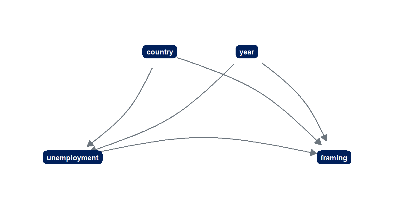
Note the two commented lines inside the dagify() call. They are the arrows that section 6 discusses, written out in the file as beliefs but switched off. Because a commented formula takes its trailing comma with it, the call parses as it stands, and growth does not exist in the graph at all until you delete the two hash marks.
5. The adjustment set
The adjustment set comes from adjustmentSets(), which returns the variables that, once held constant, close every back door and leave the causal path open.
adjustmentSets(case){ country, year }The set contains country and year. The answer is not surprising, but it is the right-hand side of a regression that has been derived from stated substantive beliefs about the case. Adjusting for country and year means letting each country have its own level and each year its own level, which is what a two-way fixed-effects model does, so the graph and the baseline specification of the course make the same claim in two notations.
The claim can be checked by fitting the model that the graph prescribes beside the three nearby models that it does not.
list(
  "nothing"          = mcosmo ~ unemp,
  "country"          = mcosmo ~ unemp + factor(cntry),
  "year"             = mcosmo ~ unemp + factor(year),
  "country and year" = mcosmo ~ unemp + factor(cntry) + factor(year)
) |>
  imap(\(f, nm) {
    p <- parameters::model_parameters(lm(f, data = euframes))
    tibble(adjusted_for = nm,
           b = p$Coefficient[p$Parameter == "unemp"],
           t = p$t[p$Parameter == "unemp"],
           p_value = p$p[p$Parameter == "unemp"])
  }) |>
  list_rbind() |>
  mutate(across(where(is.numeric), \(x) signif(x, 4)))
# A tibble: 4 × 4
adjusted_for b t p_value
<chr> <dbl> <dbl> <dbl>
1 nothing -0.001098 -1.041 2.99 e- 1
2 country -0.005645 -6.869 5.423e-11
3 year 0.0007203 0.645 5.195e- 1
4 country and year -0.003473 -3.804 1.821e- 4Read the four rows against each other before reading the last one alone. Adjusting for nothing gives a coefficient that is small and indistinguishable from zero, because the two back doors are pulling in opposite directions and largely cancelling. Adjusting for country alone gives a coefficient roughly 60 per cent larger than the coefficient under the full adjustment set, on a t of about −6.9, which is the kind of number that a researcher would be delighted to report and has no warrant for. Adjusting for year alone gives a positive coefficient – the wrong sign for the claim entirely, and comfortably non-significant. Adjusting for both, as the adjustment set requires, gives t = −3.804, the reproduction target of Part 3 of the workshop day and the value recorded for analyst C6HJR in the Multi100 project.
Of the four models, one is correct because it adjusts for the set that the graph requires, and one of the other three points the opposite way. Nothing in the data picks out the correct one. The choice comes from the graph, and so from five arrows that were drawn before any model was fitted.
The name adjustmentSets() is plural because the function returns minimally sufficient sets – sets that close every back door and have no smaller subset that also does so – and a more complicated graph will often return several, any one of which will do. The graph narrows the choice, sometimes to a single set, but often the analyst still has to choose among several.
6. The limits of fixed effects
Country and year fixed effects are frequently described as though they adjust for everything, and the graph shows why they do not. A country fixed effect absorbs whatever is constant within a country across the whole period, and a year fixed effect absorbs whatever is common to all countries in a given year. A variable that moves within a country over time is untouched by both, and if that variable causes unemployment and framing alike, it is a back door that the baseline model does not close. This is the substance of the methodological warnings about reading fixed-effects coefficients as causal quantities (Keele et al. 2020; Bell and Jones 2015).
GDP growth is such a variable, and it is one of the axes of the specification menu, where it appears as an optional copredictor. Switch on the two arrows commented out in section 4 and run adjustmentSets() again.
growth_confounds <- dagify(
  framing      ~ unemployment + country + year + growth,
  unemployment ~ country + year + growth,
  exposure = "unemployment",
  outcome  = "framing"
)

adjustmentSets(growth_confounds)
{ country, growth, year }Growth joins the adjustment set, and so the model gains a term. On the EU-frames dataset the consequence is modest.
parameters::model_parameters(
  lm(mcosmo ~ unemp + growth + factor(cntry) + factor(year), data = euframes)
) |>
  as_tibble() |>
  filter(Parameter %in% c("unemp", "growth")) |>
  select(Parameter, Coefficient, SE, t, p) |>
  mutate(across(where(is.numeric), \(x) signif(x, 3)))
# A tibble: 2 × 5
Parameter Coefficient SE t p
<chr> <dbl> <dbl> <dbl> <dbl>
1 unemp -0.00356 0.000983 -3.62 0.000361
2 growth -0.000242 0.000993 -0.244 0.808 The unemployment coefficient moves from −0.00347 to −0.00356 and growth itself contributes nothing detectable. It would be tempting to conclude that the arrows did not matter, but a small change on one dataset is a fact about this dataset and offers no general reassurance. The size of the bias that fixed effects leave behind depends on how strongly the time-varying confounder moves both variables, a quantity that cannot be observed here but is easy to write into simulated data.
set.seed(20260730)

# One draw per country and one per year, reused in both variables: that shared
# draw is what makes them confounders rather than noise.
country_level <- rnorm(27)
year_level    <- rnorm(10)

cells <- expand_grid(cntry = 1:27, year = 1:10) |>
  mutate(slump   = rnorm(n()),
         unemp   = 3 * country_level[cntry] + year_level[year] +
                   slump + rnorm(n(), 0, 0.5),
         framing = -0.30 * unemp + 2 * country_level[cntry] + year_level[year] -
                   0.4 * slump + rnorm(n(), 0, 0.5))

list(
  "nothing"                  = framing ~ unemp,
  "country and year"         = framing ~ unemp + factor(cntry) + factor(year),
  "country, year, and slump" = framing ~ unemp + slump + factor(cntry) + factor(year)
) |>
  imap(\(f, nm) {
    p <- parameters::model_parameters(lm(f, data = cells))
    tibble(adjusted_for = nm, planted = -0.30,
           estimate = p$Coefficient[p$Parameter == "unemp"],
           se       = p$SE[p$Parameter == "unemp"])
  }) |>
  list_rbind() |>
  mutate(across(where(is.numeric), \(x) signif(x, 3)))
# A tibble: 3 × 4
adjusted_for planted estimate se
<chr> <dbl> <dbl> <dbl>
1 nothing -0.3 0.296 0.0251
2 country and year -0.3 -0.616 0.0323
3 country, year, and slump -0.3 -0.323 0.0685The simulated panel has the same shape as the real one. Country levels and year levels enter both variables, which is what makes them confounders, and on top of those a slump that varies from one country-year to the next raises unemployment and depresses framing by a separate route. Read the three rows in order. Adjusting for nothing returns +0.296, the wrong sign entirely: the between-country and common-year confounding is strong enough here to reverse the association. The two-way fixed-effects model removes both of those and gives −0.616, roughly twice the planted effect and many standard errors away from it, because the slump moves within a country over time and neither fixed effect absorbs it. Adding the slump brings the estimate to −0.323, inside one standard error of −0.30.
Growth can also take a different position on the graph. Suppose you believe that unemployment depresses growth rather than the other way round, so growth lies on the path from unemployment to framing. Now it is a mediator, and the adjustment set depends on which effect you have named.
growth_mediates <- dagify(
  framing      ~ unemployment + country + year + growth,
  growth       ~ unemployment,
  unemployment ~ country + year,
  exposure = "unemployment",
  outcome  = "framing"
)

list(total = "total", direct = "direct") |>
  map(\(e) adjustmentSets(growth_mediates, effect = e))
$total
{ country, year }
$direct
{ country, growth, year }Depending on which of the two defensible beliefs about growth you hold, and which quantity you want, the graphs give three different formulas. The menu axis that offers growth as a copredictor is therefore a choice between two claims about what the unemployment coefficient means, and running the model both ways as a robustness check does not make that choice. Nor will a coefficient on growth that looks ‘supported by the data’ settle it, because the two graphs make identical predictions about the data.
TipTry it
In the fe-sim recipe, change the coefficient of the slump on framing from −0.4 to 0 and refit. The fixed-effects estimate comes out at the planted value, because a variable that causes only the exposure is not a confounder at all. Then set it to −0.4 again and change the coefficient of the slump on unemployment to 0. The same thing happens for the mirror-image reason. A confounder has to reach both ends of the arrow you are estimating, and the recipe lets you break each half in turn.
7. The bailout on the graph
The EU-frames dataset contains a bailout column, a 0/1 indicator marking the 26 country-years in which the country was under a financial-assistance programme. It is a small variable that can cause a good deal of trouble, because two reasonable analysts can put it in two different places on the graph.
The first analyst believes that unemployment triggers a bailout, and that being under a programme is itself what sours how people talk about the EU. That makes the bailout a mediator on the path of interest, and the total effect of unemployment therefore requires leaving it out. The model below puts it in anyway.
parameters::model_parameters(
  lm(mcosmo ~ unemp + bailout + factor(cntry) + factor(year), data = euframes)
) |>
  as_tibble() |>
  filter(Parameter %in% c("unemp", "bailout")) |>
  select(Parameter, Coefficient, SE, t, p) |>
  mutate(across(where(is.numeric), \(x) signif(x, 3)))
# A tibble: 2 × 5
Parameter Coefficient SE t p
<chr> <dbl> <dbl> <dbl> <dbl>
1 unemp -0.00195 0.00101 -1.92 0.0558
2 bailout -0.0354 0.011 -3.22 0.00148The unemployment coefficient falls by nearly half, from −0.00347 to −0.00195, and its t drops below conventional significance. The bailout term is itself sizeable and clearly estimated. If the bailout is a mediator, the fall should not be read as a weakening of the effect of unemployment. The adjustment has taken the part of the effect that passes through the bailout out of the total and assigned it to the bailout term.
The second analyst takes a different route to what looks like the same caution. Bailout country-years are unusual, so drop them and see whether the result survives. That option is on the specification menu as a sample restriction, and it is the kind of check that reviewers ask for by reflex.
m_dropped <- lm(mcosmo ~ unemp + factor(cntry) + factor(year),
                data = filter(euframes, bailout == 0))

parameters::model_parameters(m_dropped) |>
  as_tibble() |>
  filter(Parameter == "unemp") |>
  select(Coefficient, SE, t, p) |>
  mutate(across(where(is.numeric), \(x) signif(x, 3)))
# A tibble: 1 × 4
Coefficient SE t p
<dbl> <dbl> <dbl> <dbl>
1 -0.000423 0.00123 -0.343 0.732On 244 country-years instead of 270, the effect is gone. The coefficient is about an eighth of the size of C6HJR’s published Multi100 coefficient, on a t of roughly −0.34, and no referee would accept it as evidence of an effect.
The rule in section 3 says that selecting on a variable is conditioning on it, so if the bailout is a common effect of unemployment and of framing, dropping bailout country-years is conditioning on a collider and the vanished effect is an artefact of the restriction. If instead the bailout is a mediator, the restriction removes the very country-years in which the mechanism operated, and the vanished effect indicates that the association was concentrated there. If it is neither, and bailout countries simply happen to account for most of the real relationship, then the restriction has thrown away the informative half of the sample. No statistic computed from these 270 rows can tell the three explanations apart. The choice between them has to be made before the restricted model is fitted, in a graph that states which one you are assuming.
8. Graphs and data
A last temptation is to treat the graph as provisional, in the expectation that the data will eventually adjudicate it. D’Agostino McGowan et al. (2024) demonstrate why the data cannot do this. The authors construct four datasets with identical exposure–outcome coefficients, identical correlations, and near-identical scatterplots, generated by four different causal structures. Adjusting for the covariate is correct in one of them and wrong in the other three, and the adjustment moves the estimate in a different direction in each. Nothing computed from the observed variables tells the four apart, because what differs between them is not in the observed variables.
It follows that fit criteria can actively mislead in choosing a control set. Katrin Auspurg makes the point about a large multiverse of political-science models, where the AIC comparison reported in the study itself systematically favours the specifications she classes as unjustified (Auspurg 2025, 1). A model that adjusts for a collider will often fit better than the one that does not, because the collider genuinely predicts the outcome. Predictive performance is a poor guide to a control set, even though it is often the one that analysts follow without saying so.
Two working rules can be drawn from the sections above, and both are cheap to apply. The first is time ordering: nothing that happens after the exposure can be a confounder of it, so do not adjust for the future. That single habit forecloses most mediator errors without any theory at all, and ggdag::time_ordered_coords() will lay a graph out in temporal layers so that a violation is visible on the page. The second is that the graph belongs in the published paper. Once it is in print, a reader who disagrees can point at the arrow they would remove and say what it would change, which is a far more productive argument than one about whether a control set is sensible.
A four-step procedure covers most first graphs. State the estimand in words – the quantity, for which units, contrasting what with what. List every variable that you believe is causally involved as a node of the graph, including the ones you cannot measure. Draw the arrows you would defend and comment out the ones you would not. Then read the adjustment set, and write the model formula from it. The multiverse module picks the argument up from there, since a graph is what the critics of large specification universes ask analysts to supply.
9. Your own graph
The exercise for this section uses a question from your own research in place of the EU-frames case, and it has two halves.
First, state an estimand for a question you actually care about, in one or two sentences and in the vocabulary of Lundberg et al. (2021). Name the unit of analysis, the outcome, the contrast that defines the effect, and the population over which you want it. ‘The effect of unemployment on framing’ is not yet an estimand. ‘The average change in a country’s mean cosmopolitan framing associated with a one-point rise in its own unemployment rate, across EU member states between 2004 and 2013, holding fixed everything that persists within a country and everything common to a year’ is one, and notice that the second half of it is already an adjustment set.
Second, draw it. Open a script, load ggdag, and write a dagify() call with one formula per arrow. Include the variables you cannot measure, because their absence from your data does not remove them from the world and the graph is where that fact becomes visible. Comment out the arrows you are unsure of, then run adjustmentSets() twice, once with them and once without, and see whether your model changes. Write the formula that the set implies and compare it with the model you were going to fit anyway.
TipTry it
Do the exercise above on the last analysis you ran, not on a hypothetical one. Then find the control variable in that model that would be hardest to defend in a seminar, put it on the graph, and work out which of the three shapes it is. If it turns out to be a collider, or a mediator in a model you reported as a total effect, you have learned something that could not be read from the model output.
Sources and further reading
The estimand-first framing of the whole module is Lundberg et al. (2021), and the standard book-length treatment of causal graphs for social scientists is Hernán and Robins (2020), freely available online. Huntington-Klein (2021) is the gentlest full-length introduction and covers all three shapes with worked examples. On fixed effects specifically, Keele et al. (2020) is the careful statement of what a fixed-effects coefficient does and does not identify, and Bell and Jones (2015) makes the same argument from the multilevel side. On colliders, Cole et al. (2010) is the general treatment and Griffith et al. (2020) the most widely read applied demonstration. The four-dataset demonstration that no statistic chooses an adjustment set is D’Agostino McGowan et al. (2024). For the debate about what all this implies for large specification universes, see Auspurg (2025) and the multiverse module.
The software documentation is unusually good and worth reading directly: the ggdag package site at https://r-causal.github.io/ggdag/, whose introductory vignette is the source of the water-in-a-pipe picture used in section 2, and the dagitty documentation at https://dagitty.net/, which also hosts a browser tool for sketching a graph by hand before writing it down as formulas.
References
Auspurg, Katrin. 2025. “Robustness Is Better Assessed with a Few Thoughtful Models Than with Billions of Regressions.” Proceedings of the National Academy of Sciences 122 (43): e2521917122. https://doi.org/10.1073/pnas.2521917122.
Bell, Andrew, and Kelvyn Jones. 2015. “Explaining Fixed Effects: Random Effects Modeling of Time-Series Cross-Sectional and Panel Data.” Political Science Research and Methods 3 (1): 133–53. https://doi.org/10.1017/psrm.2014.7.
Cole, Stephen R., Robert W. Platt, Enrique F. Schisterman, et al. 2010. “Illustrating Bias Due to Conditioning on a Collider.” International Journal of Epidemiology 39 (2): 417–20. https://doi.org/10.1093/ije/dyp334.
D’Agostino McGowan, Lucy, Travis Gerke, and Malcolm Barrett. 2024. “Causal Inference Is Not Just a Statistics Problem.” Journal of Statistics and Data Science Education 32 (2): 150–55. https://doi.org/10.1080/26939169.2023.2276446.
Griffith, Gareth J., Tim T. Morris, Matthew J. Tudball, et al. 2020. “Collider Bias Undermines Our Understanding of COVID-19 Disease Risk and Severity.” Nature Communications 11 (1): 5749. https://doi.org/10.1038/s41467-020-19478-2.
Hernán, Miguel A., and James M. Robins. 2020. Causal Inference: What If. Chapman & Hall/CRC.
Huntington-Klein, Nick. 2021. The Effect: An Introduction to Research Design and Causality. Chapman & Hall/CRC. https://theeffectbook.net/.
Keele, Luke, Randolph T. Stevenson, and Felix Elwert. 2020. “The Causal Interpretation of Estimated Associations in Regression Models.” Political Science Research and Methods 8 (1): 1–13. https://doi.org/10.1017/psrm.2019.31.
Lundberg, Ian, Rebecca Johnson, and Brandon M. Stewart. 2021. “What Is Your Estimand? Defining the Target Quantity Connects Statistical Evidence to Theory.” American Sociological Review 86 (3): 532–65. https://doi.org/10.1177/00031224211004187.
Teney, Céline. 2016. “Does the EU Economic Crisis Undermine Subjective Europeanization? Assessing the Dynamics of Citizens’ EU Framing Between 2004 and 2013.” European Sociological Review 32 (5): 619–33. https://doi.org/10.1093/esr/jcw008.